
Good day our fellow readers!
Today we will be writing and explaining to you some common terms you see on your photo editing apps such as Snapseed and VSCO. This will be a 3 part series where we dive in deep into the different terms and settings you can toggle to create different photo effects and creating the perfect photo that you desire.
In this blog post, we will be focusing on 5 terms – Contrast, White Balance, Hue, Saturation and Lightness (also known as HSL). Hopefully, through this short post you will be able to understand these terms better while editing your photos.
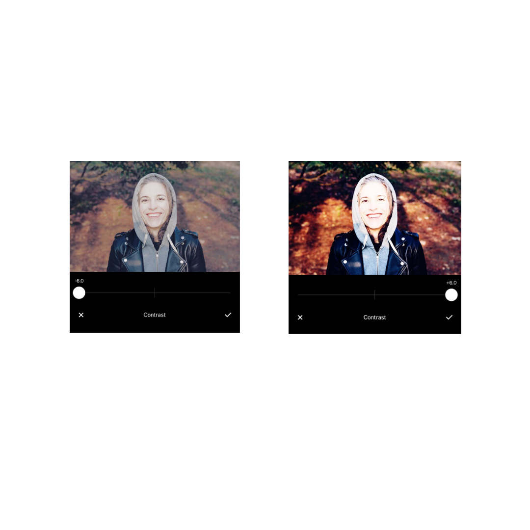
Contrast
What does it really mean when you adjust ‘Contrast’ during photo editing? Increasing contrast makes shadows darker and highlights brighter. To put it in simpler terms, higher contrast tends to make an image more bold in colour, while lower contrast makes it flatter. With low contrast, lack of difference between light and dark will tend to give you a more muted photo.
If you would like enhance the details in your photo, you can make use of contrast to do so! However, too much contrast can sometimes make your photo look overexposed.
White balance
As you may know, there are huge differences in color temperature between bright sunlight outdoors and indoors lighting. Sunlight is generally warmer in tone and indoor lighting can appear gloomy in photos. By adjusting the white balance, you can achieve a more natural-looking photo.
This is especially useful for close-up individual portrait shots. You can adjust the white balance of the photo to adjust the colour of the skin tone so to achieve a more natural shot. For cooler tone photos, you might want increase the ‘Temperature’ of the photo to make it warmer, more natural. Be careful not to go overboard!
Some photographers like to go for cooler tones in their images. I would not say there is a clear rule on how much should edit the white balance in your photos or any fixed setting to achieve a perfect photo and it is all up to your own personal preference.
Personally, I like photos which are warmer in tones especially for close up portrait shots. This brings out the warmth in the photo and creating a more natural looking skin tone.

Hue
By definition, the noun, hue means both a colour and a shade of a colour. It’s calculated in degrees of the color wheel and it refers to a color wheel that goes from red, to yellow, to lime, to aqua, to blue, to magenta, and finally back to red. For this reason, 0° on the hue color wheel is red and then 360° is red again. Hue always refers to the base, pure colour.
Here is an illustration that will help you understand better!

Saturation
Saturation is how pure the hue is. In other words, it refers to the intensity of a color. Saturation ranges between 0% and 100%. The higher the saturation, the more vivid it is. The lower the saturation of a color, the closer it is to grey. 0% saturation will always be grey.
Let’s take a look at how this can affect your photo.
The raw image looks a little flat to me. To bring out the colours of the image better and the warmth of the sunlight shone on the subject’s face, I would increase the saturation by a little, perhaps +3.0. Turning up the saturation of your photos can help to make the colours in your photo pop.
I will also bring down the brightness (or exposure on some apps) as you can see that the face of the subject is slightly overexposed. This will create a more balance photo.

Lightness
Lightness, sometimes known as brightness, is the amount of white or black mixed in with the color. Similarly, it ranges from 0% to 100%. 0% lightness will always be black; 100% will be completely white.
Contrast vs saturation
Well, some of you might be thinking, what’s the difference between Saturation and Contrast? Here is a comparison:

As you can see, when Saturation is put to the maximum the colours in the picture become more intense. The orange tones are now more pronounced. However, when you set Contrast to the maximum, the shadows became darker and some parts became over-exposed.
Hopefully with this blog post, you know a little more about photo editing!
For those of you who wish to read up more about photo taking, you can read our previous blog posts on 4 Photo Effects to Step Up Your Instagram Game.
You must be logged in to post a comment.